Nike Strength
Services rendered — Creative, Art Direction
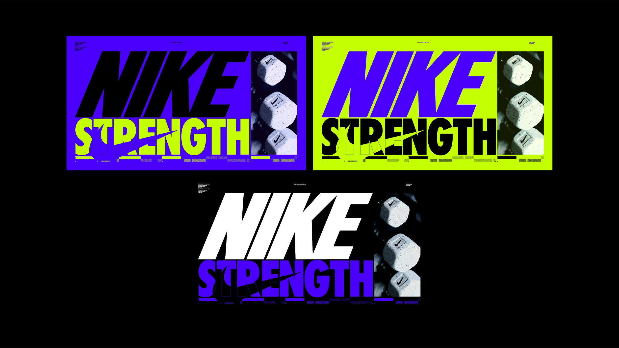
Nike Strength is a focused visual identity system created to reflect the intensity and discipline of strength training. The design language combines bold, condensed typography with high-contrast colorways—electric lime, saturated cobalt, and deep black—to convey energy, resilience, and control.
Photography is raw and intentional, highlighting the physicality of training through textured black-and-white and duotone treatments. Layered graphic elements—such as type overlays, grit textures, and glitch-inspired motion cues—introduce a sense of dynamism and disruption, evoking the grind and power of the gym environment.
This system was designed to be modular and scalable across platforms, from digital content to in-store visuals. It’s direct, high-impact, and built to resonate with athletes who train with purpose.